The Cooper-Hewitt’s latest exhibition explores the use of sound, scent, touch, and taste in contemporary design.
The Cooper-Hewitt, like most design museums, focuses on the visual. Touch is discouraged among valuable collections, scent and taste are often too ephemeral to preserve, and sound gets overlooked.
But with The Senses: Design Beyond Vision, the museum expands its scope to embrace all the senses. At the gallery’s entrance, the curators identify three key themes for recent sensory design (and the exhibition): it is physical, it enhances experience, and it is inclusive.
On entering the space, I found myself standing between two showy installations; to the left, a faux-fur wall invited touch and responded with snippets of orchestral music. To my right, a series of translucent pillars glowed with LED light, describing fanciful emotions (“collective deja-vu”) and releasing scents when activated (or so they say – I couldn’t smell anything). These first two pieces suggested an additional theme, that of sensory luxury in the absence of any real functional utility – a theme that continued throughout the exhibition, alas.
Heading to the right I found two more semi-immersive experiences; a series of pendant lights shifted color temperature depending on where a user stood, and an array of suspended felt spheres gave off a light scent and sound when touched. I was underwhelmed by both of these, and in the latter case, I still couldn’t smell anything… Was I experiencing my own sensory impairment, or were the scent-based prototypes poorly designed?

Around the corner was the first big hit of the exhibition – a series of chairs entitled Seated Catalog of Feelings. A soundtrack of white noise played as floor projections defined a sequence of unusual sensations: “A Jackson Pollock canvas,” “Falling backward into a tub of jello,” etc. Each theme was experienced solely through haptic feedback, as the chair cushion transfered knocks, vibrations, and bounces to the seated visitor. You could call it a theme park trick, but the design is clever and impeccably executed. Throughout my tour of the gallery, I heard giggles and gasps emanating regularly from this corner of the room.
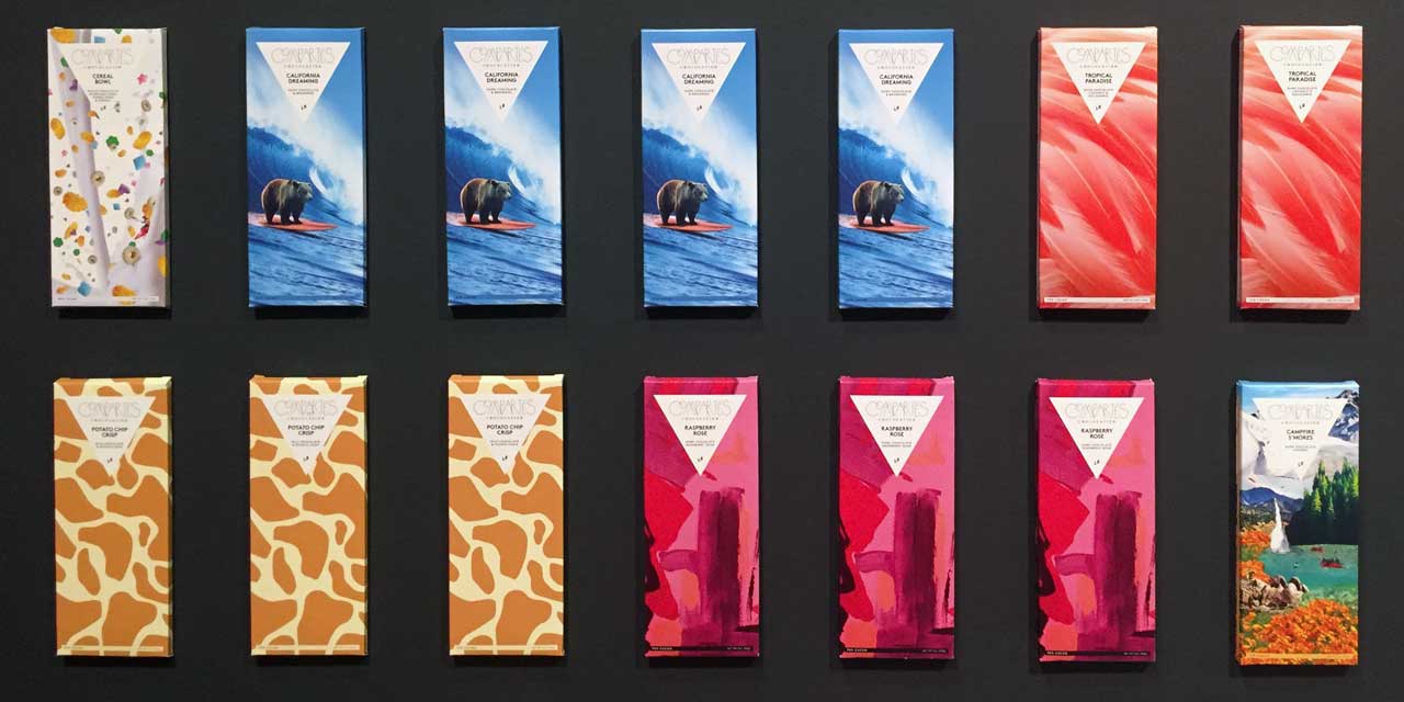
Nearby, another theme emerges, in bold, graphic album covers from Diagonal Records and distressed typographic posters from the London Symphony Orchestra: synesthesia. Throughout the galleries, many of the more engaging pieces translate one sense into another; audio waveforms are 3-D printed into tactile form, the taste buds inspire musical compositions, candles and chocolate bars are presented in vibrant packaging. I was intrigued by the more functional bits of synesthesia, like Alarm Fatigue, an audio feedback tool for hospitals that communicates patient health by modulating the pitch, tempo, and timbre of music. This is some of the strongest content in the exhibition, with a freshness to the design that feels very contemporary – but using colorful labels to sell candy hardly constitutes a new approach.

The exhibition is also strong when tackling the truly functional value of multi-sensory design. There’s a fair amount of tactile design for the visually impaired, such as an interactive map of the Smithsonian campus and a children’s picture book with 3D-printed illustrations. A new experiment in tactile typography mimics the shapes of visual letters, making it easy to learn for those who lose sight later in life. And every label within the gallery incorporates dimensional UV printing, which places transparent Braille text directly over the corresponding printed captions.
My most frustrating experience was also related to design for the visually impaired. One corner of the gallery featured the Sensory Theater, a small media projection space. The first piece I saw, Visual Sounds of the Amazon, used particle-effect animations to visualize recorded sounds of birds and insects. The images were fantastic, but the audio track was dominated by a voice annotation describing the animations – loudly enough that the original, inspirational sounds were inaudible. I appreciate the museum’s initiative to be universally accessible, but the nuances of the audio and its connection to the animations got lost along the way.
 Nearby, two other large-scale installations provided good photo-ops, but seemed like they might be more at home in a children’s museum. Feather Fountain, with an embedded fan blowing feathers upward into the sky, engaged visitors but didn’t seem to function properly without manual intervention. FlavorFactory, a giant, toy-like installation featured embedded video screens that were activated using physical dials and switches, changing the imagery from appetizing (candy) to disgusting (worms). I liked the overall look of both these piece, but given the exhibition’s stated themes, they felt superficial and conceptually underdeveloped.
Near the end of the gallery, several spaces focus on domestic design, and while not as extravagant as some of the larger installations, the content is strong and nicely presented. Here, plastic dishware uses vibrant color to encourage and assist Alzheimer’s patients in regular eating, cast silverware takes on the shape of a knitted textile to inspire a cozy, comforting meal, and organic ceramic shapes augment meals by providing the illusion of a fuller plate. In this section, I was finally able to confirm that my sense of smell was intact, as scent players from Ode gave me the vivid sensation of cheese pizza and black forest cake.

The exhibition design, by Studio Joseph, makes good use of tactile elements, defining spaces through curved walls of woven nylon threads; the dark palette allow the more vibrant objects to pop with color. The exhibit looks great, as can be expected from the Cooper-Hewitt.
But thematically, the larger scale, non-functional installations muddy the waters and throw off the stated messages. As much as the Cooper-Hewitt has been at the forefront of promoting functional, accessible design, they also love a good photo op. I’d almost have preferred that the curators identify some of these experiences as fun and superficial; to put barely-functional concept designs next to life-saving innovations has always struck me as problematic.
Despite this inconsistency, the exhibition is full of fascinating, inspiring objects, and while some are more innovative than others, they provide an intriguing view into current trends in multi-sensory design.