On developing a complex digital exhibit, from prototype to opening day… and beyond.
In part one of this post, I focused on the design challenges faced in the development of the Virtual Microbial Art Lab (VMAL) at Liberty Science Center. Today, I’ll look at how technology both helped and hindered our process.
Digital Prototyping
Shortly after our team initiated UX design, I built the first in a series of working digital prototypes. The earliest and simplest of these was designed to help the team understand how it feels to ‘paint’ onscreen and see no results. While we knew this would be a required feature, it was important to try this out, since we shared a concern that users would find this confusing and frustrating. Through testing, we determined that subtle visual feedback, in the form of tiny gray pixels, could be sufficient to let visitors know that their input was received.

Prototype 2 introduced tool selection and sterilization, as well as pop-up hints to guide users through the process. Prototype 3 introduced stamp shape tools and variable temperature incubation, while version 4 added a new feature – antibiotic discs that inhibit microbe growth – that we eventually decided to cut, as it made things a bit too confusing.
Additional prototypes added the approved look and feel designs, tweaked the incubator’s control panel to make it more intuitive, introduced the broader palette of microbe styles and colors, and addressed many more macro- and microinteractions. After the seventh prototype, I switched my focus to the full tabletop experience, but I was able to do so with the confidence that our entire team was on the same page about how VMAL would work, and what features it would offer. Still, there were many, many additional software iterations to come before opening day.
Technical Challenges
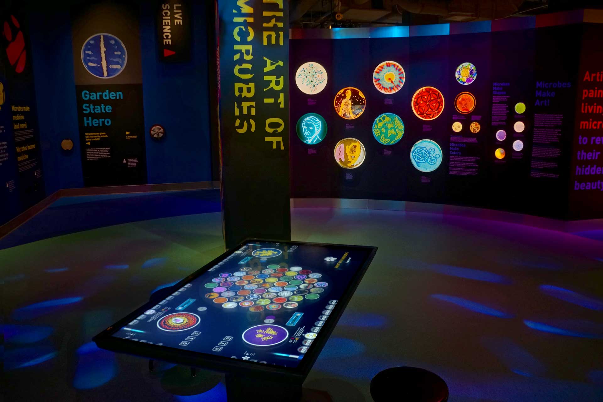
When working at the scale of the table, a whole new set of challenges emerged. Most notably, building out four concurrent interfaces at 4K resolution, along with the constantly-updating virtual gallery, put tremendous strain on the computer’s resources. Part of this was inevitable – in a typical painting or drawing program, the user adds to an artwork step-by-step, so the application only needs to process one brushstroke at a time. For VMAL, I needed to record each user’s cumulative interactions, then when incubation begins, animate thousands of microbes simultaneously in response. As such, the more complex the user’s input, the slower the program runs, which can lead to sluggish, frustrating user experiences.

Instead of constraining user interaction, I implemented some subtle optimizations. Since the microbes blend together as they grow, I was able to remove excessive paint points without impacting the visual effect. Once 20 layers of color have been applied, the application now reaches a ‘stopping point,’ where it gently asks users to incubate their layers before continuing. (Once a layer has fully grown, it can be ‘flattened’ and no longer takes up processing time.) Lastly, the application distributes rendering – if multiple stations are incubating simultaneously, it alternates between them, subtly reducing the framerate in order to maintain responsiveness.
One of the most colorful – and complex – of the features added at this stage was a series of animated Easter eggs. When multiple visitors select the same microbe, these hidden triggers present video imagery of the microbe’s real-world context – from baking bread to manufacturing antibiotics. The most complex of these triggers a video of quorum-sensing microbes, which communicate with one another through chemical signal molecules, and can be genetically modified to show this communication through bioluminescence. The quorum sensing animation triggers audio and lighting effects that expand the table’s presence within the gallery to present a brief moment of immersion.
 The Easter eggs added a new layer of visual content on top of everything else that was happening on the table, and in first tests, the videos appeared with a frustratingly sluggish frame rate. A series of optimizations – reducing resolution, pre-rendering masks, and freezing all other activity on the table – helped bring them up to full speed.
Another challenge involved the table’s sharing features, which allow visitors to send themselves their artwork via email or text message. For security purposes, LSC exhibits as a rule do not have Internet access; to circumvent this, we set up a local web server on the table’s CPU to communicate directly with LSC’s Gmail servers. Working closely with the museum’s internal Technology Group, we were able to open up just the communication ports required to send out the emails and texts.
UX, Redux
The exhibition opened just before the holiday break, and was well received, but it quickly became apparent that visitors were struggling with the interface. As I noted in the first part of this post, this was not unexpected. Our choice to closely mirror a real-world lab process was counterintuitive to visitors used to freeform painting apps… and we anticipated this.
Initially, an animated, non-interactive tutorial led users through the creation process, with a hand icon tapping the interface elements in sequence. Unfortunately, we found that visitors trying to mimic the tutorial steps would accidentally exit, leaving them more confused than when they started.

After considering a few options, and reviewing similar onboarding tutorials in mobile apps, we opted for a more structured, more interactive tutorial. Users now receive one instruction at a time; the table then pauses until they perform the requested interaction. To maintain focus and avoid confusion, interface elements are dimmed out when not in use. Visitors can still exit out of the tutorial at any time, but now they must actively hit a ‘skip’ button.
In observation we found that the step-by-step ‘nudging’ gave users a better understanding of the interface and the process, making them much more comfortable continuing on with their designs after the tutorial ended. We had striven for an open, free-form exploration, but ultimately found that a structured flow was more successful in both communicating the scientific process and in empowering visitors to create artwork.
After dozens of wireframes, prototypes, design iterations, and post-installation revisions, we ended up with an exhibit that strikes a solid balance between a fun creative experience and the complex scientific process it was designed to simulate. Over the past few month, we’ve logged thousands of users who’ve shared hundreds of artworks, spending an average of more than 5 minutes per session creating virtual microbial art.
Many thanks to the entire team at Liberty Science Center, as led by Liza Rawson, Head of Exhibition Development and Design, for all their hard work in bringing this to life – along with Focus Lighting, Dimensional Communications, Inc., and Ideum for making us all look good!
One thought on “Case Study: Virtual Microbes, Part 2”